
Mobile UI/UX • Tracking • Service Design
Project Overview
The journal entry feature of the Vincere Health app was used to track the habits of people who were quitting smoking. The original tracker was under utilized and had a 90% drop off rate on top of inconsistent use.
Product
The Vincere Health app is a tool used in tandem with personal coaches and monetary rewards to help socioeconomically challenged users quit smoking.
My Contributions
As the Vincere Health’s product designer, I worked with the quit coaches and dev team to bring this product to life. I made everything from user flows and wireframes, to illustrations and high fidelity prototypes.
Goals:
+ Improve user drop-off rate
+ Make recording something typically shameful positive
Deliverables:
+ Updated user flow to include new features
+ Updated tracking design to match the rest of the app
Constraints:
+ Simple and minimal text – users typically had a 4th grade reading level
User Research
The Vincere quit coaches were my greatest asset on this project. Having your users’ experts on your team is an incredible addition. I was able to interview the coaches about what they wanted their participants to keep track of for their weekly meetings, and then had the coaches get feedback from their participants on how they felt about the current tracking feature. Because the coaches were meeting with their participants and attending design meetings every week, it was easy to iterate on feedback quickly.
Methods
Interviewing coaches, getting feedback from users via coaches
Findings
Users forgot about the tracking feature.
They didn’t find it rewarding and weren’t motivated to keep up with it.
They wanted to be able to see their progress.
Coaches wanted users to track their smoking habits for quantitative research. They wanted users to track the circumstances around their smoking habits to help them understand why they were smoking and make a plan to counteract it.
Development
There were two major routes I took in exploring the redesign of this feature. One guided the user through the entire tracking process in an immersive step by step style. The other placed all the tracking options on one screen for faster and easier input.
Methods
User flows, user testing, wire framing, low and high fidelity prototypes
Findings
Users preferred the single-screen tracking option. They typically spent no more than 5 minutes on the app per day (including their breath tests, which took about 2 minutes each) and were put off by going through a long multi-screen process.
Even when a menu was added so users could track items individually, they preferred not to be brought to secondary screens and felt trapped when each tracker prompted them to add more in another section.
Some steps were also simplified and merged—vape hits and cigarettes were merged into “Smoking”, cravings and triggers were put under this section as well.
Option 1: Guided Step by Step Tracking
Option 2: One Screen Tracking

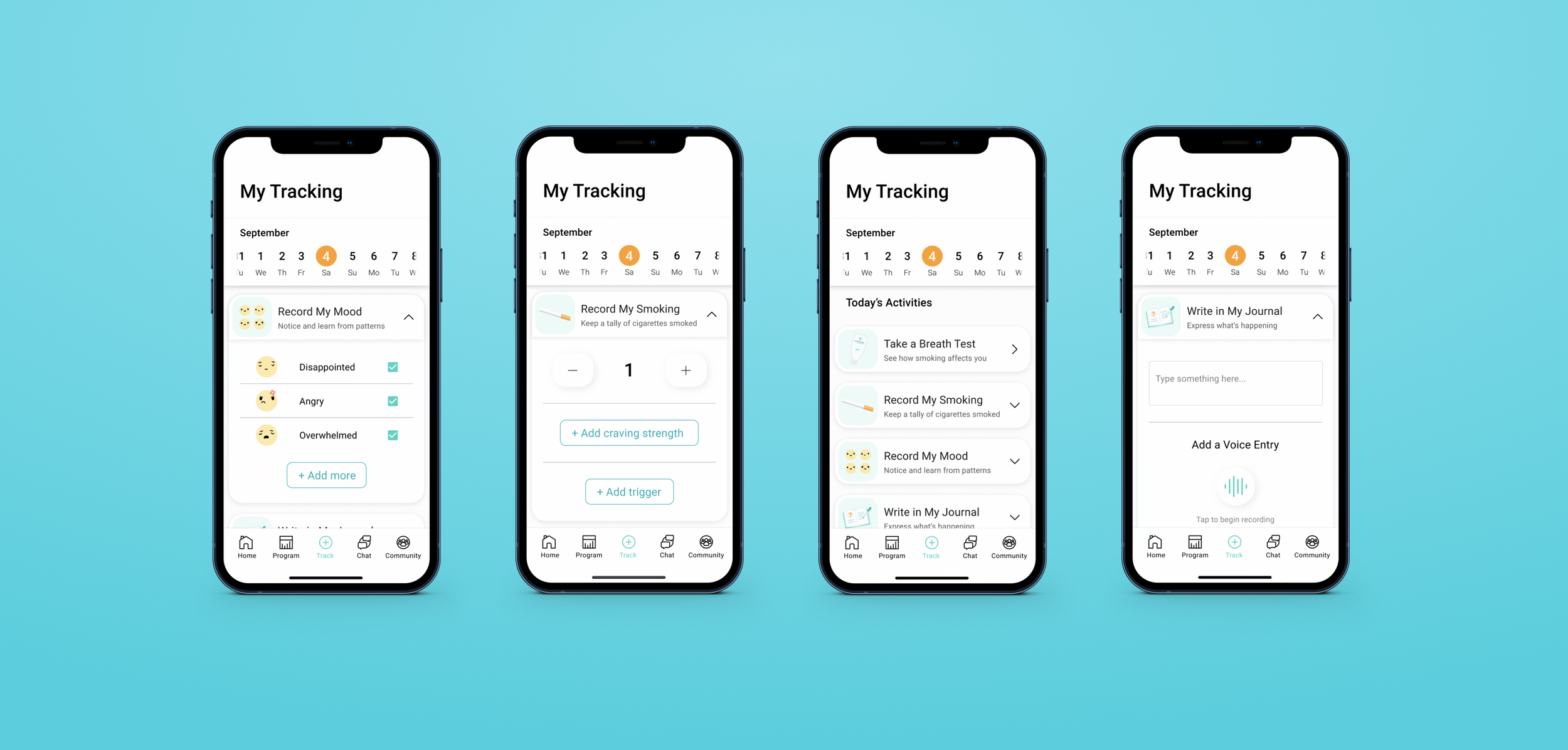
Final UI
After iterating between the step-by-step and one-screen options, I did my best to create something that incorporated the best of both; the simplicity of the single screen, and the light-heartedness of the step-by-step’s illustrations.
We were not able to add the data analytics piece because of time constraints on development. Still, the updated design successfully captured significantly more users than before within the first week of launching.
Major Updates
The style of the tracking feature was updated to match the aesthetics of the rest of the app, making it less clinical and more fun to use.
New features included more choices for mood, and journal entry.
Outcomes
User drop off rate improved by 80%