
Intro
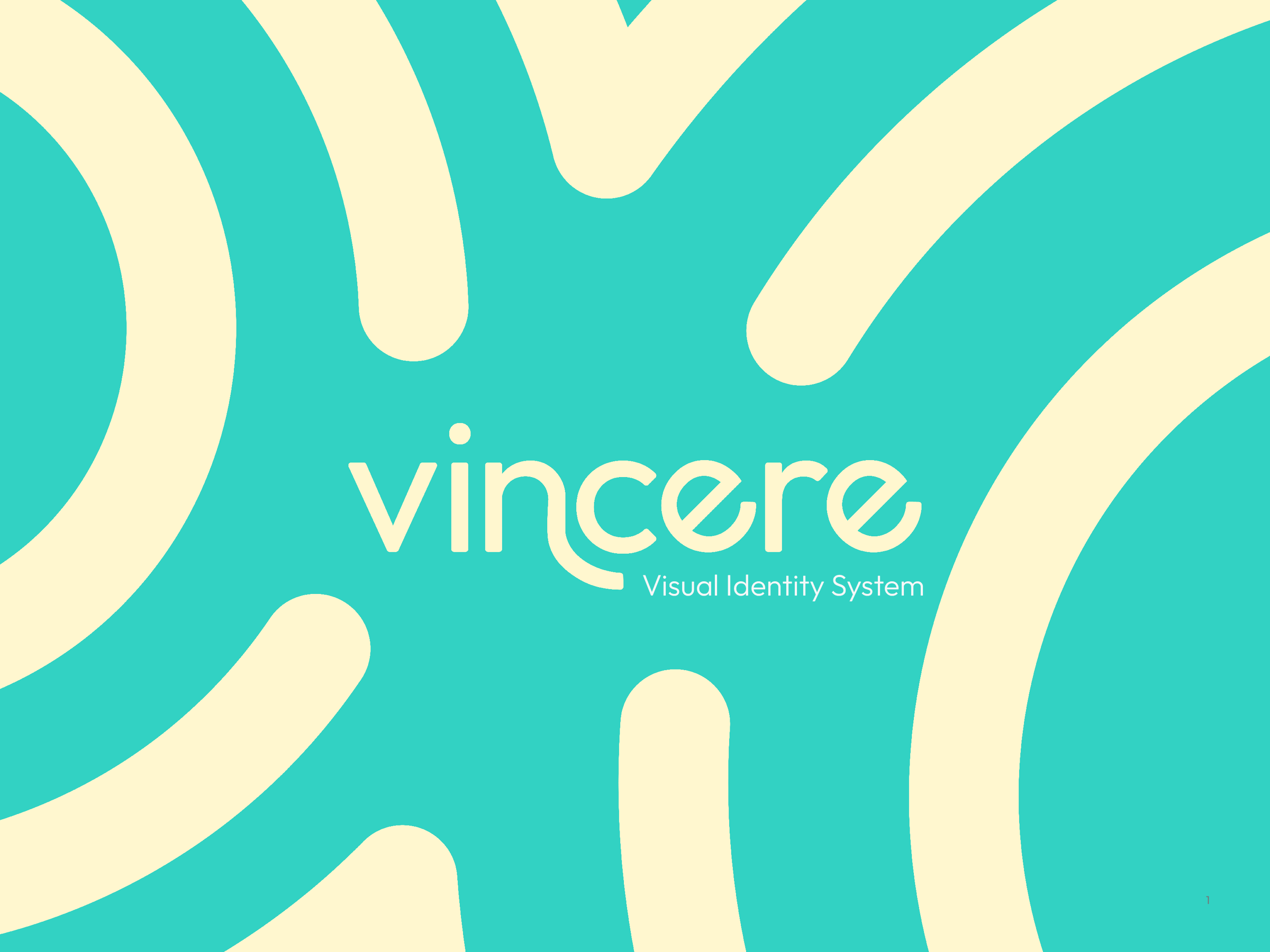
Vincere Health uses tech to help people quit smoking.
The Vincere Identity System is the result of a rebrand project that took place over the course of four months. As the full time product designer, I was able to dedicate all my time to drafting and iterating on different options until we finally came to the ripple design. Ultimately we chose this design not only because of its versatility, but because it resonated with the mission of the company; to start a ripple effect of better habits.

Original Logo

New Logo

The Process
Iteration
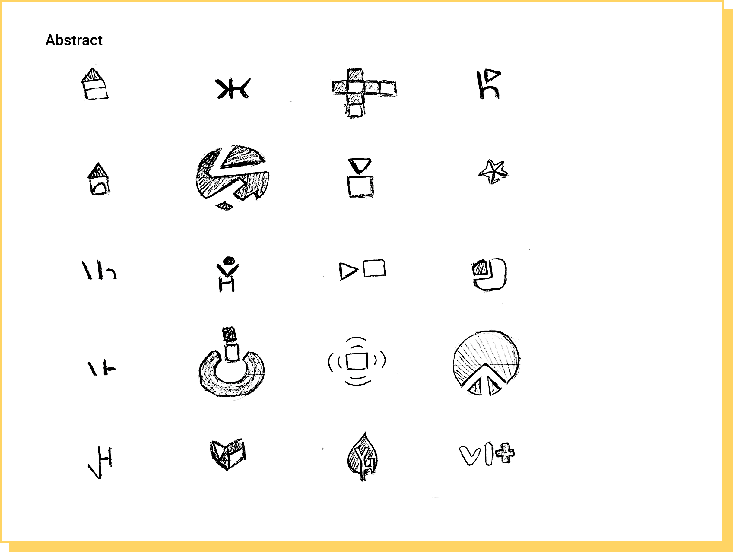
This project went through a series of iterations that involved sketching, presenting, getting feedback from the team, and applying that critique to the logo options. To begin the process, I created 90 sketches and asked the team to choose 5 directions that resonated with them.


5 Directions

Direction 1: Cairn

Direction 2: Koi fish

Direction 3: Lettermark
Direction 4: Wordmark

Direction 5: Sunrise
Exploration

Direction 1: Cairn

Direction 2: Koi Fish

Direction 3: Lettermark

Direction 4: Wordmark

Direction 5: Sunrise
3 Directions
Direction 1: Cairn
This pictorial direction was created with the idea that the Vincere program and coaches acted as a guide to each participant’s journey, much like cairns act as guides on trails.
These digital drafts explored how we might be able to manipulate and simplify the shape of a cairn, how negative space could be used to create a new image, and how this type of organic imagery could work with the brand’s wordmark.
Direction 2: Koi Fish
This pictorial direction was based more on the brand itself than the brand experience. In Latin, “vincere” translates to “to overcome, conquer, or defeat.” In my symbolism research, I found that koi fish symbolize overcoming adversity.
These digital drafts explored how far koi fish could be simplified and still be recognizable, and how we might use their number and positioning to convey ideas of partnership and balance.

Direction 3: Wordmark
We knew that the wordmark would ultimately be paired up with whatever icon we decided on, but we wanted it to be able to express the brand’s personality on its own. These designs were meant to convey friendly and welcoming emotions.

The Process
Refinement
In the third round of iterations, we scrapped the cairn direction and moved towards refining and combining the koi fish and wordmark.
Color palettes and style were experimented with during this phase to get a better hold of the feelings we wanted this rebrand to evoke.
Exploration


The Process
Last Minute Pivot
Coming towards the end of the project, we decided that the koi fish may not be as accessible to our audience as it could be. Parts of the cairn design were taken and combined with a simplified version of the water ripples used as accents with the koi fish to create the final concept.
The ripple idea was inspired by the head coach, Sheryl Melanson, who likened her process of helping participants quit smoking with starting a ripple effect of positive change in their lives.

The Process
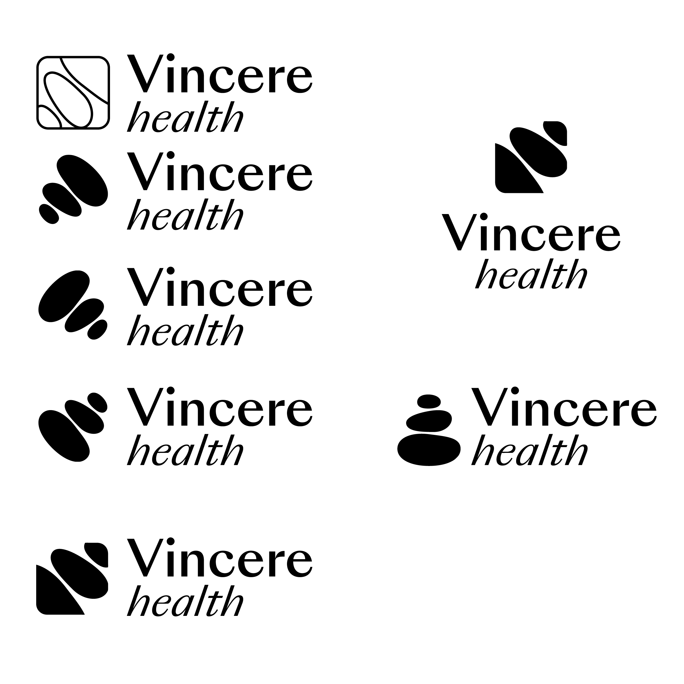
Final Logo Suite
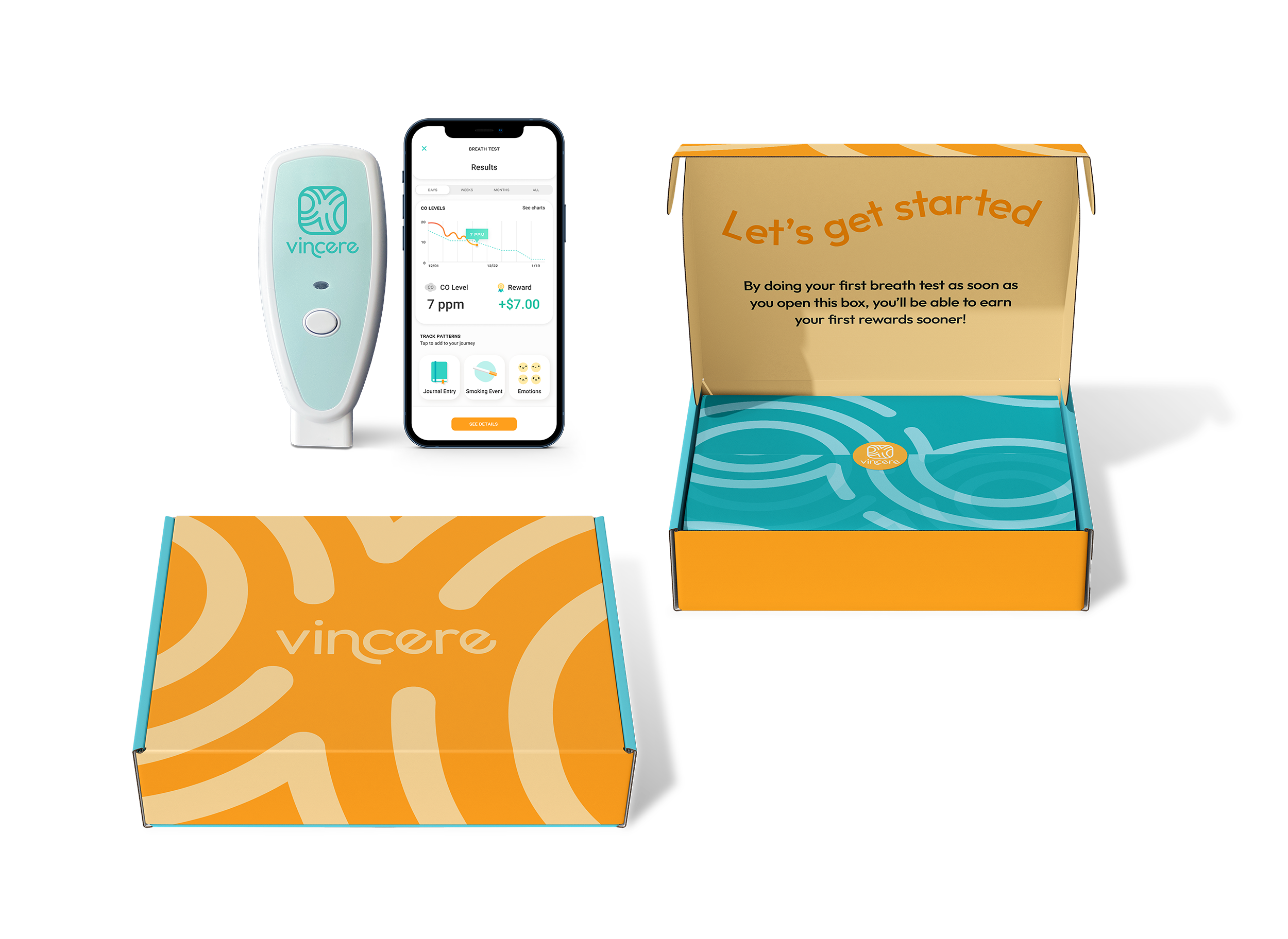
After trying some more natural color palettes, we decided to go with an updated version of the current palette. We wanted this brand to look fun, emphasizing a bright, positive outlook on something that is usually seen in a negative light.
The ripples in the final logo turned out to be a great accent piece for the brand. Their shape makes them a versatile asset as different parts of the ripple can be cropped to make different patterns.
The final wordmark is an altered version of Outfit, and was made to reflect the ripples and movement seen in the icon.


