
Campaigns • Account Management • Data Analytics • Service Design
Project Overview
Users weren’t aware of features or how to use them. Content was too technical for the average user to understand, and it was requiring interventions from our team to manage and set up campaigns.
Product
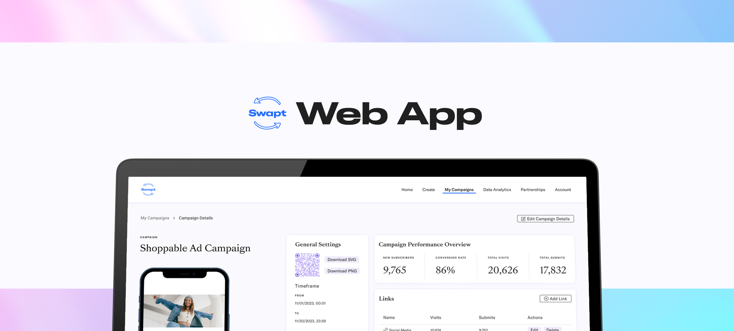
The Swapt Web App is a hub for customer engagement. At its core, the Web App acts as an analytic platform that manages and analyzes ROI from market campaigns in a creative way.
My Contributions
As the only designer on the team, I lead this project from end to end. I was responsible for planning, managing, researching and designing this platform. Collaborating with the dev team and CEO, we were able to finish this project within our two-week sprint timeline.
Goals:
+ Simplify the process of campaign creation
+ Improve aesthetics of web app
Deliverables:
+ Campaign Creation Interface
+ Campaign Hub
Constraints:
+ Short time frame — 2 week design sprint
+ Material design — could only use customized MUI components
Original Screens (Before Design Update)

Original Flow

Home Screen
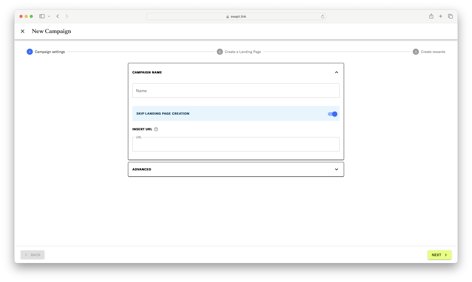
Step 1: Campaign Settings

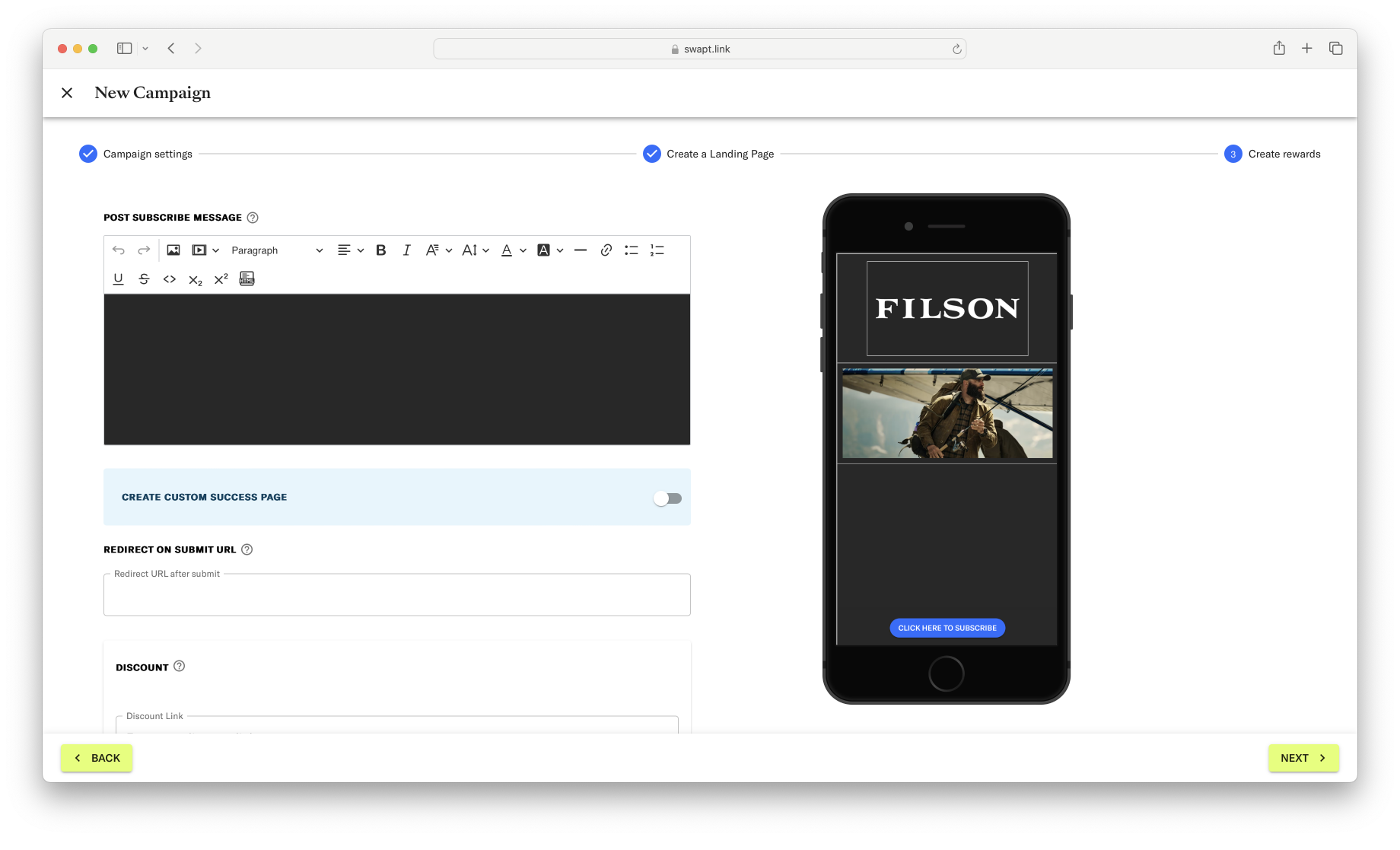
Step 2: Create a Landing Page
Step 3: Create Rewards

Step 4: Save and Launch Campaign
User Research
Despite our short time frame, I made sure to schedule a few interviews. The platform had been created quickly and had been added onto with features requested by customers without any plans for how they would interact with each other.
Doing user testing and interviews was essential to discovering not only where users were getting lost or why they were dropping off, but to see what they came to Swapt to do. Breaking the platform down to the basics would allow us to grow it into a more thoughtful product, and an enjoyable experience.
Methods
Interview questions, live walk-throughs, final thoughts
Findings
One of the biggest issues I found during these interviews was in the language that was used. With technical labels and no descriptions, users were unable to decipher what did what. This seemed to be a big part in why no one was using any new features.
Users were also put off by the aesthetics of the platform — they wanted it to feel more fun.
Finally, users found creating a campaign to be an arduous task. There were too many steps, and they found it annoying that they had to re-enter information like their social media accounts.
It became clear that we needed to tell users why to use our app instead of how.
Development
Using the information I got from user interviews, an internal assessment of the platform’s flow and usability, and prioritization meetings with the team, I created a product roadmap.
Bi-weekly and ad hoc meetings with the dev team and CEO ensured we were on track and creating mutually achievable content.
Methods
Feature hierarchy, product roadmapping, user flows, product maps
Findings
Because of the timeframe, there were some features that couldn’t be addressed, like creating a drag and drop editor.
We did not have a design system, so that needed to be created before anything past mapping could be done.
There were a lot of pieces to this web app that even I didn’t understand (like UTM parameters and hidden content) and had to hash out with the team—if I could get it, the users could get it.

Product Roadmap

Updated Campaign Creator Flow
Final UI
After two weeks, I had finished creating a design system, rewrote content, redesigned the flow of creating, managing, and editing campaigns, and created a fresh new design for the web app.
Major Updates
The overall process of creating a campaign was simplified into three screens and re-organized. Everything that affected how the campaign looked was grouped on one page so users could see how different features would affect the layout and design of their landing pages.
Each part of the campaign that the user could edit was rewritten in easier to understand language and given simple one-line descriptions.
Before, users had to open a new pop-up for each feature or form field they wanted to add. This added frustration, confusion, and a lot of extra clicks. The new design placed everything on one screen in a series of drop downs so that users could see and edit each part of their landing page at once.
The home page (which was just the campaign listings) was replaced with an account hub, allowing users a bird’s eye view of campaigns, users, and overall performance.
Campaign detail pages were updated to display everything about the campaign and its sub-pages. Previously, the detail page only showed data collected on the entire campaign, and information on users was kept in a master list for the entire account. The ability to edit sub-pages was also added to this screen, as it had previously only been accessible from the campaign listing screen.
Outcomes
700 accounts created within the next month and 43% of new users created a page self-service.